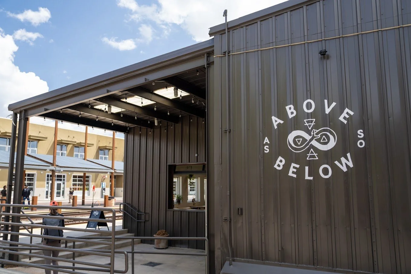
AS ABOVE, SO BELOW
DISTILLERY
BUILDING A BRAND WORLD
Role: Brand System Development, Label Illustration, Packaging Design
Agency: High Proof Creative
Client: As Above So Below Distillery
For more than two years, I have been partnering with As Above So Below to transform a boutique distillery into a fully realized brand universe. I’ve designed the entire tarot-inspired label collection, established a scalable packaging hierarchy system, and created award-winning spirits packaging. The result has positioned AASB, High-Proof Creative and myself as one of the most distinctive in our industries.
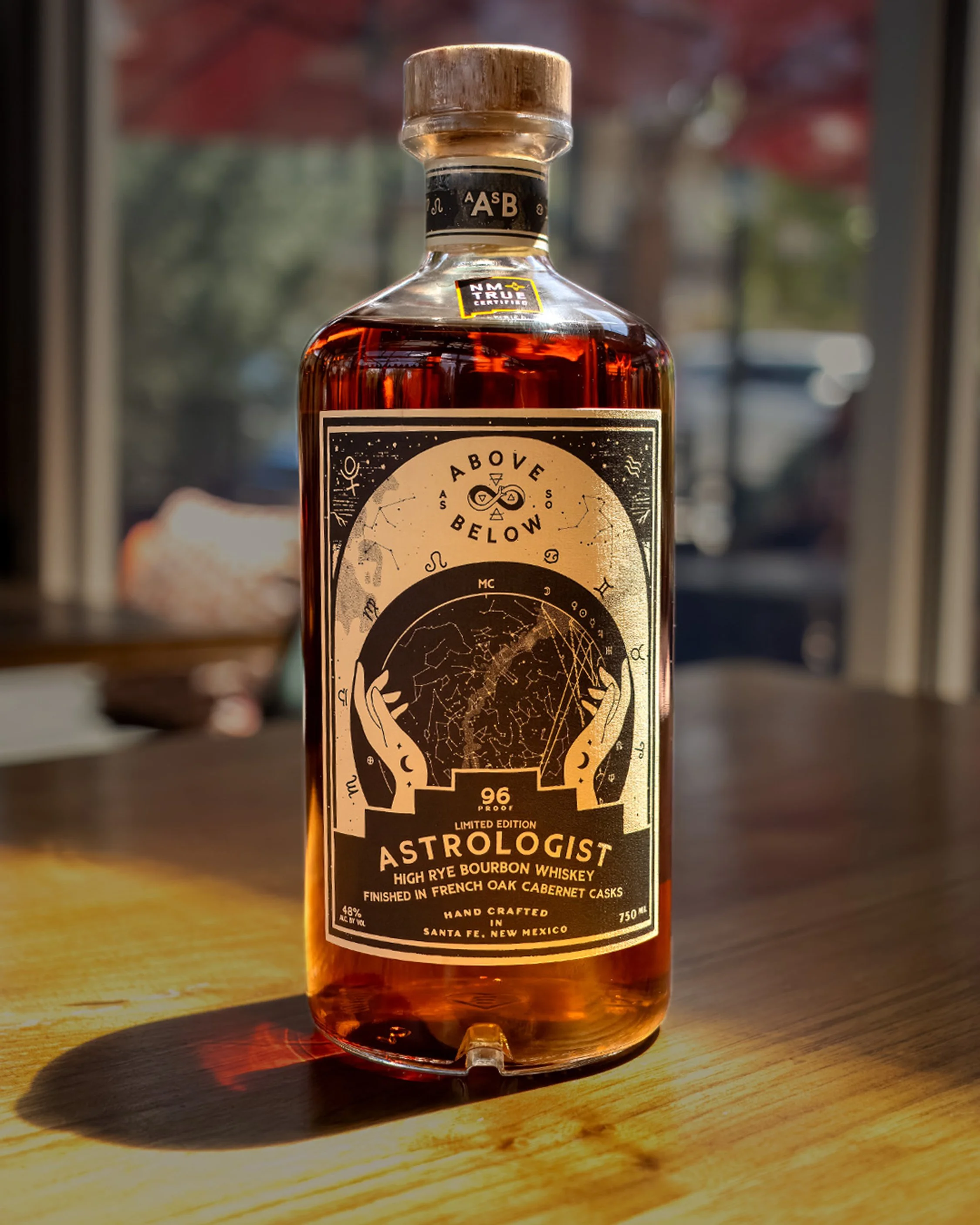
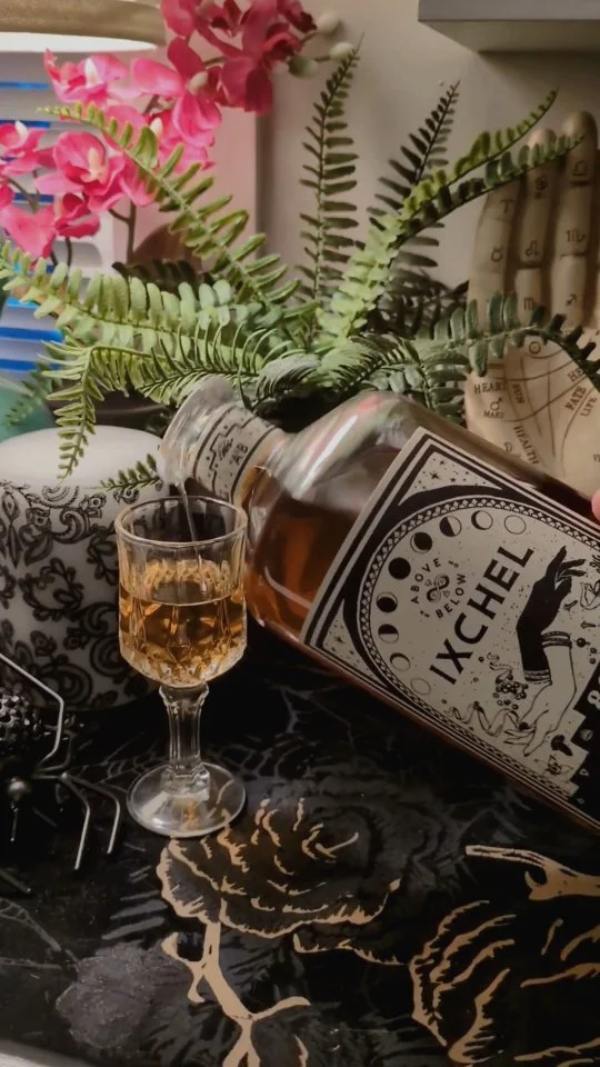
tarot series
At the heart of AASB’s identity is the Tarot Series — a complete system of labels inspired by the symbolism and mystique of tarot cards. I've designed every card in the series, ensuring each release carries its own story while remaining cohesive within the broader family. This collection created a powerful narrative thread that turns every bottle into a collectible piece of art, resonating deeply with consumers and collectors alike.


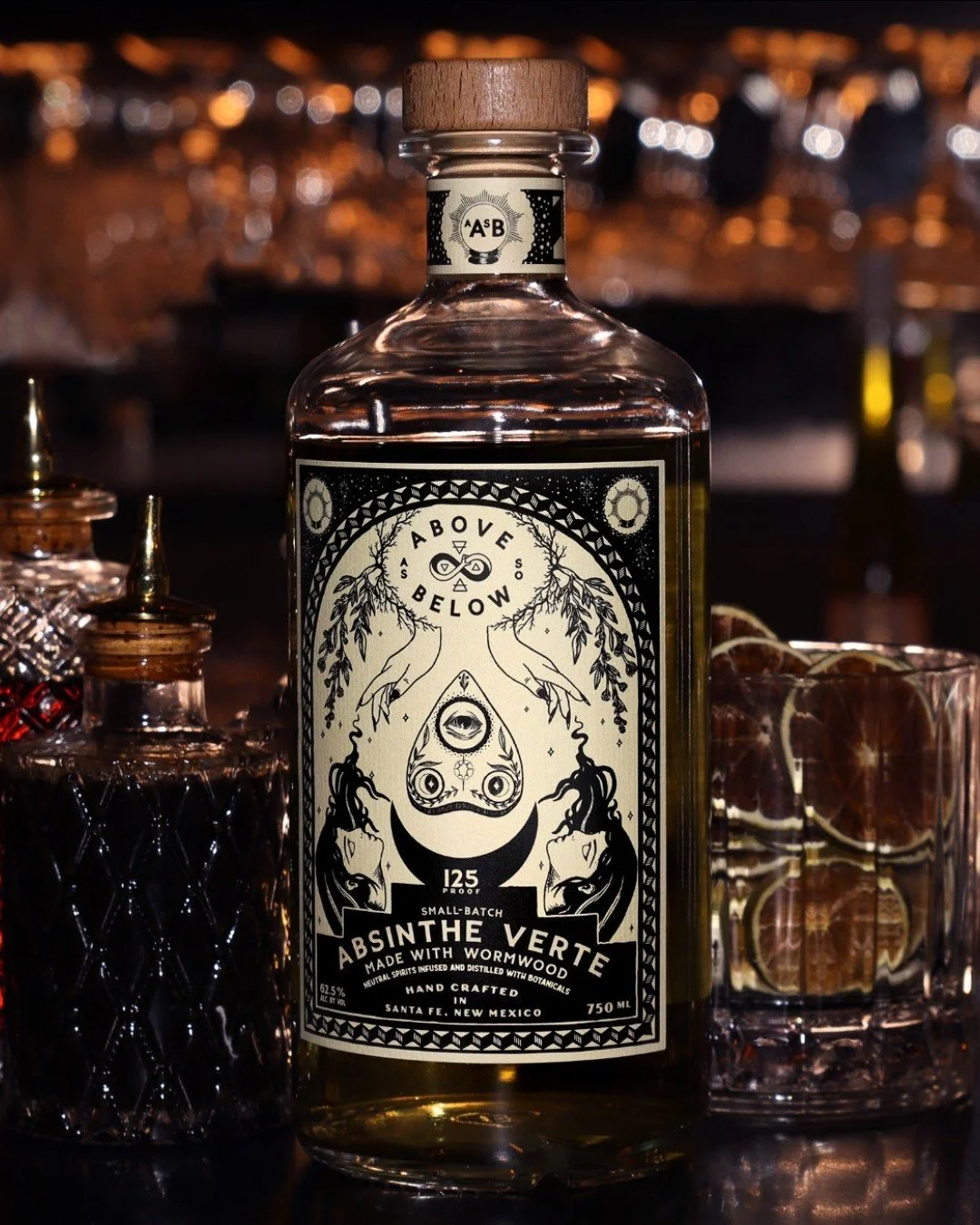

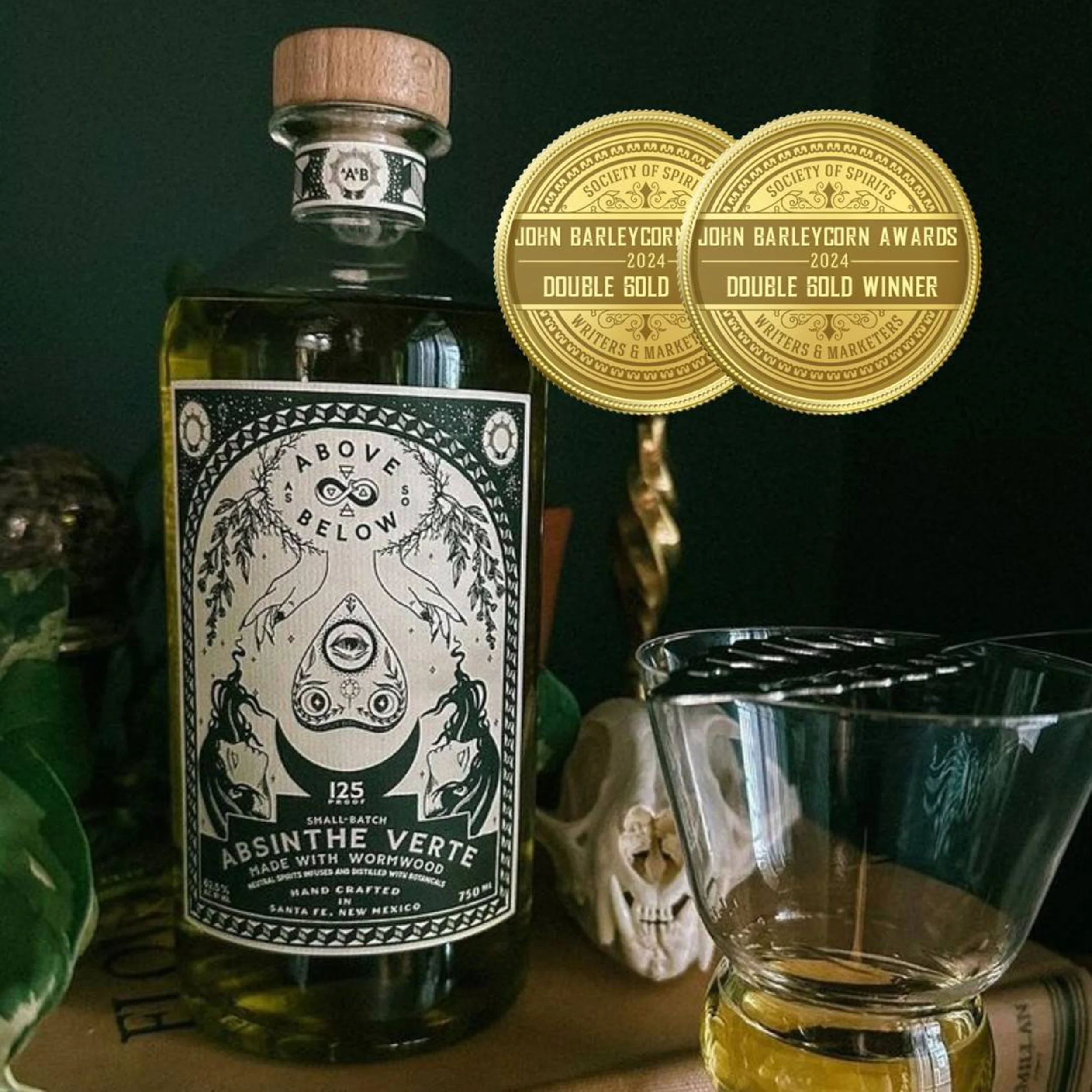
award winning absinthe verte
The Absinthe Verte release became a flagship achievement for AASB — and for me personally. With its elegant detailing and bold hierarchy, the label captured the spirit’s heritage while adding modern sophistication. This design was honored with a Double Gold at the John Barleycorn Awards, cementing AASB’s place among elite craft distilleries and showcasing my ability to merge storytelling with premium packaging design.
Recognition: Double Gold, John Barleycorn Awards
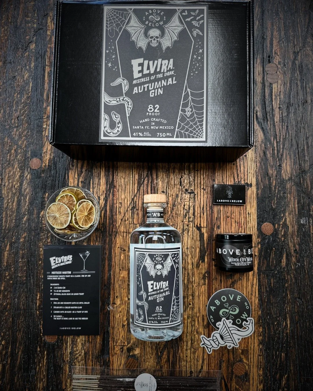
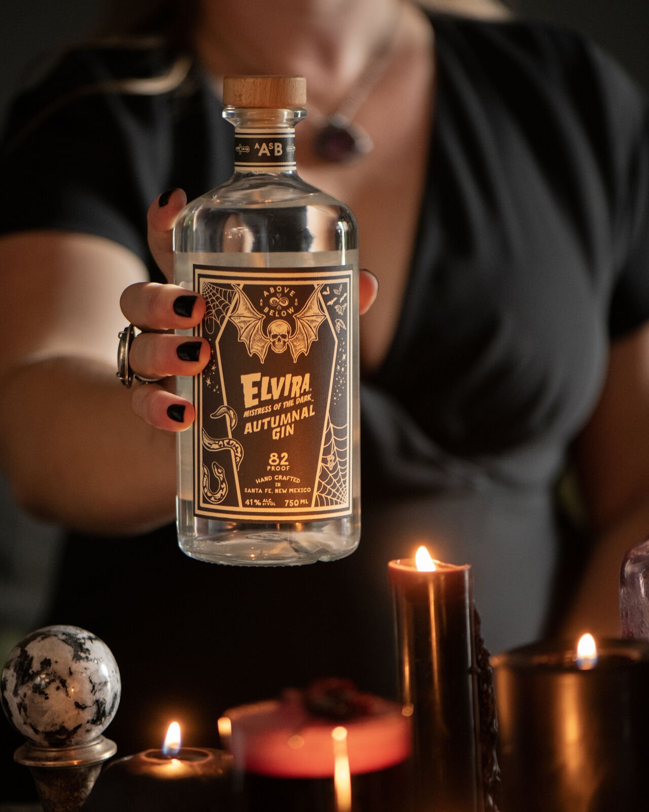
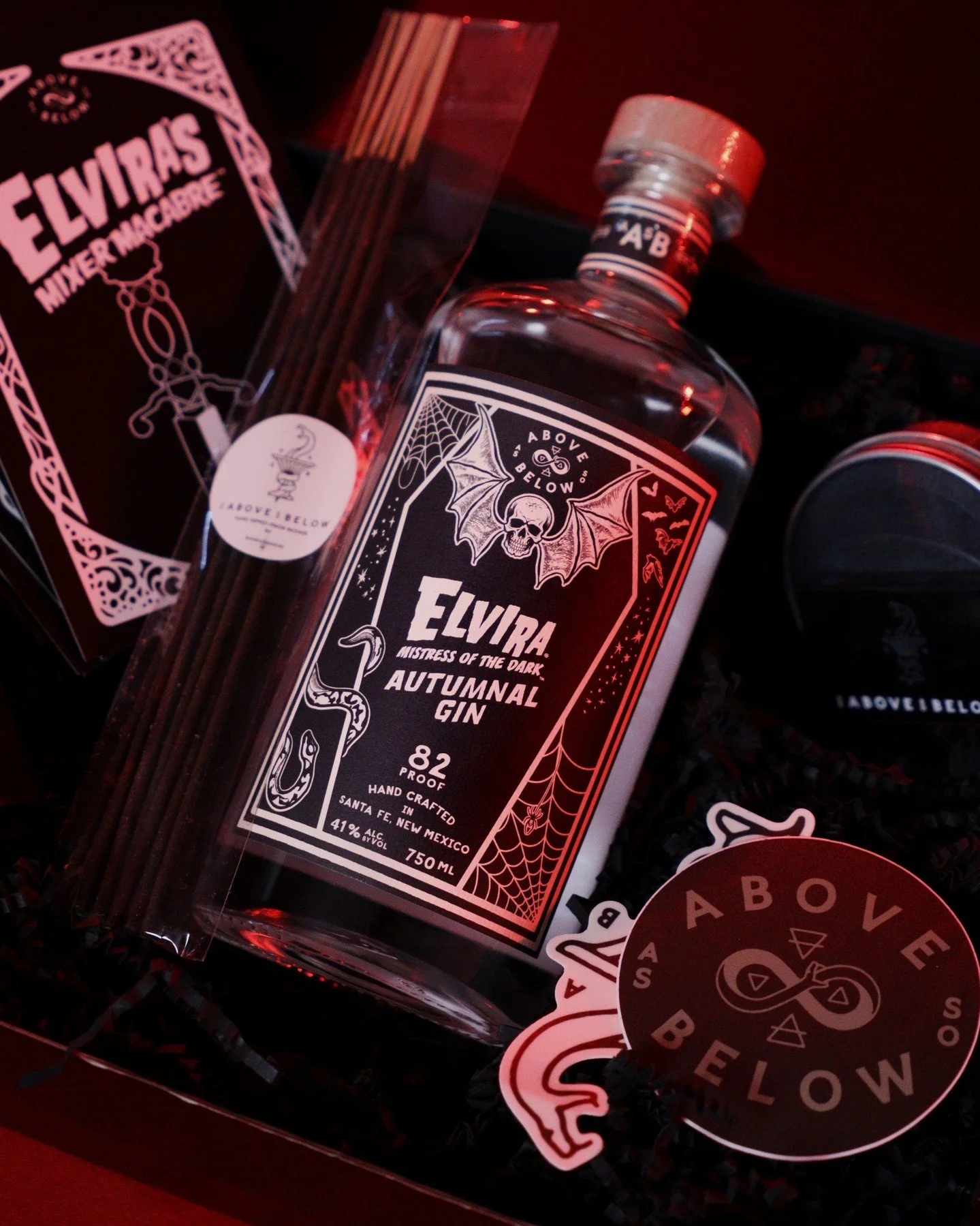
Elvira, mistress of the dark
For a special release, AASB partnered with cultural icon Elvira, Mistress of the Dark. I designed the packaging for the limited-edition Autumnal Gin, introducing the inaugural chapter of a collaboration that immediately resonated with fans of both brands.
The bottle celebrates Elvira’s unmistakable presence while remaining authentically AASB—melding theatrical gothic elements with a polished, premium spirits aesthetic.