
VETUS DISTILLERY
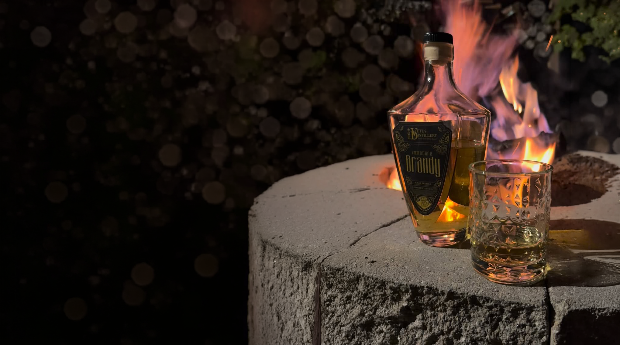
Brandy Labels — Premium Packaging
Classic structure, elevated through detail and restraint.

overview
Vetus Distillery’s brandy line required a packaging system that reflected heritage, craftsmanship, and premium positioning.
the challenge
Create a label that feels timeless and refined—without becoming static or overly traditional.
the approach
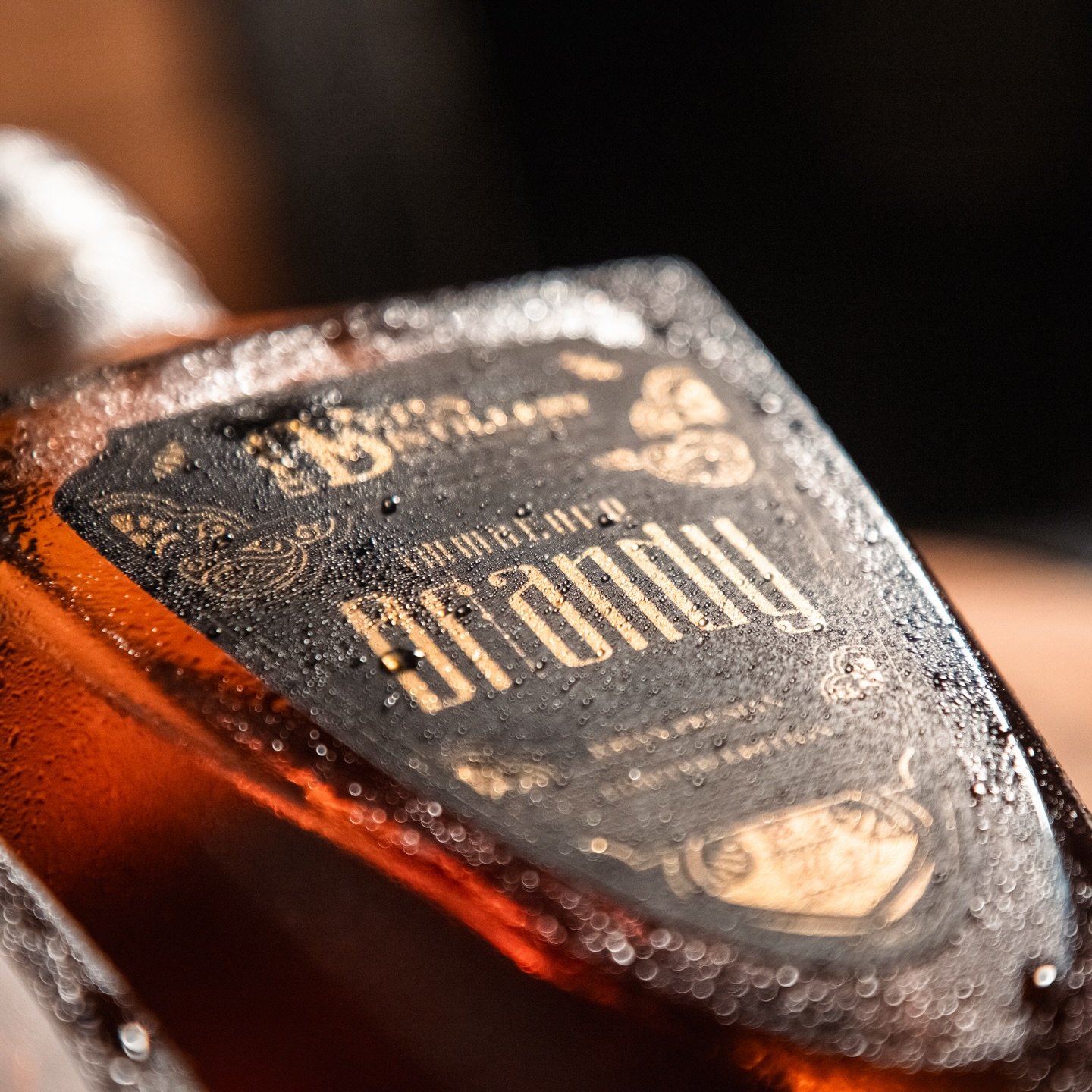
I focused on structure and detail—building a system that uses ornate elements selectively, allowing the composition and typography to carry a sense of confidence and clarity.
KEY DESIGN MOVES
Ornamental detailing used with restraint
Strong typographic hierarchy
Symmetrical, grounded composition
Warm, premium color palette

outcome & impact
A cohesive label system that reinforces quality and tradition while maintaining a clean, elevated presence.