

copper widow
A refined spirits identity built for bold character and shelf presence. Where western grit meets elevated craft.


overview
Copper Widow was developed as a premium spirits brand designed to feel both grounded and elevated—rooted in western character while competing in a modern craft market.
The goal was to create a visual identity that carried weight: something that felt established, intentional, and unmistakably bold on the shelf.
From identity through packaging, the work focused on building a cohesive system that could support the brand as it grows.
the challenge
Balancing grit with refinement.
The brand needed to embody strength and character without feeling overly rustic or dated—striking a balance between heritage inspiration and premium positioning.
the approach
Structure meets attitude.
I built a system that combines strong typographic hierarchy, ornamental detail, and restrained color palettes—creating a look that feels both timeless and distinctive.

THE SYSTEM
Designed for presence.
The identity centers around clarity, confidence, and control—using structure to elevate the brand while allowing subtle details to add depth.
Strong typographic hierarchy for immediate shelf recognition
Ornamental frameworks inspired by heritage spirits design
Controlled color systems to differentiate product variations
Label architecture designed for scalability across SKUs
The result is a brand that feels established from day one.
FEATURED DETAILS
Core Identity
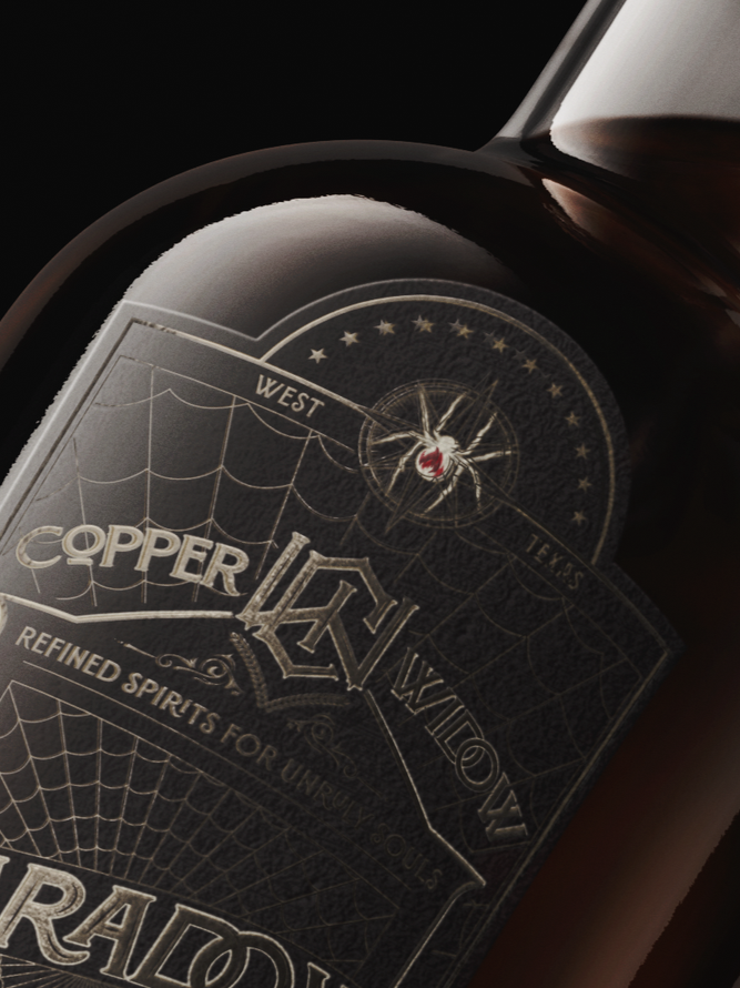
A bold, grounded identity designed to anchor the brand.
The mark and typography establish a strong foundation—balancing western influence with a refined, premium tone that translates seamlessly into packaging.
Packaging
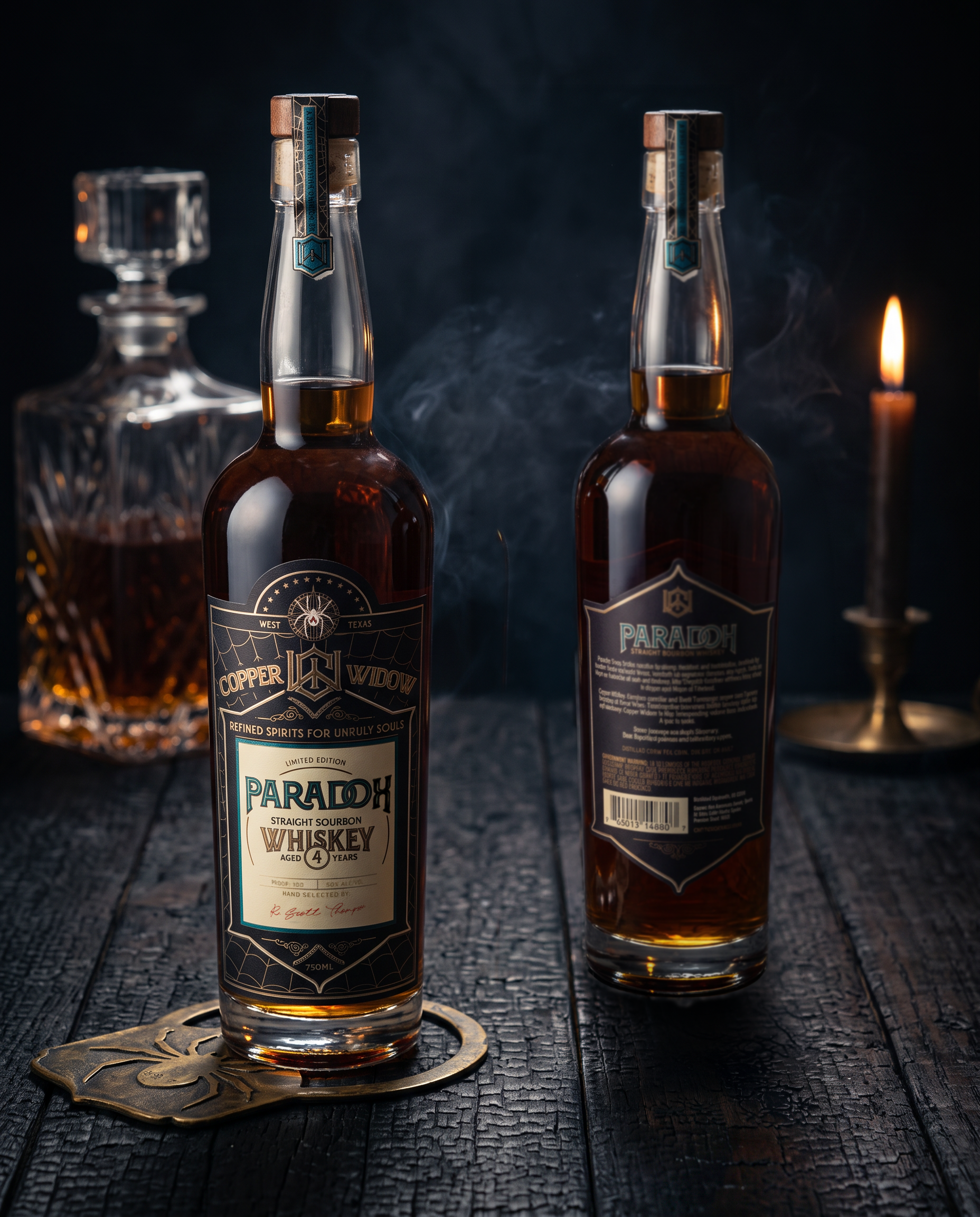
Built for both clarity and character.
Each label maintains a consistent structure while allowing variation through color, detail, and hierarchy—ensuring the line feels cohesive without becoming repetitive.

real-world ready.
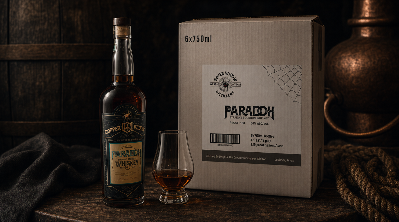
Designed to perform beyond the concept.
The packaging was developed with production and shelf presence in mind—ensuring the brand holds its integrity across print, display, and digital use.
From close-up detail to distance impact, the system delivers at every level.
Premium Brand Positioning
Scalable Packaging System
Built for Shelf Impact and Longevity
Great brands don’t just look the part. They carry it.
Copper Widow was built to stand its ground— on the shelf and beyond it.