
As Above,
So Below
Distillery
Building a symbolic spirits system rooted in ritual, mythology, and modern craft.

overview
As Above, So Below Distillery isn’t just a spirits brand—it’s a fully realized world.
Rooted in mysticism, symbolism, and narrative, the brand required more than individual labels. It needed a system that could hold complexity—allowing each spirit to tell its own story while remaining part of a cohesive, recognizable whole.
I led the development of the brand’s packaging system, designing every tarot-inspired label and building a hierarchy that could scale across multiple spirits, editions, and future releases.
the challenge
Designing within complexity.
Each product carried its own symbolism, narrative, and tone—yet needed to feel unified under a single brand. The challenge was creating a system that embraced detail without losing clarity or cohesion.
the approach
System through symbolism.
I developed a structured hierarchy rooted in tarot and occult visual language—balancing intricate illustration with disciplined layout systems to ensure consistency across every release.
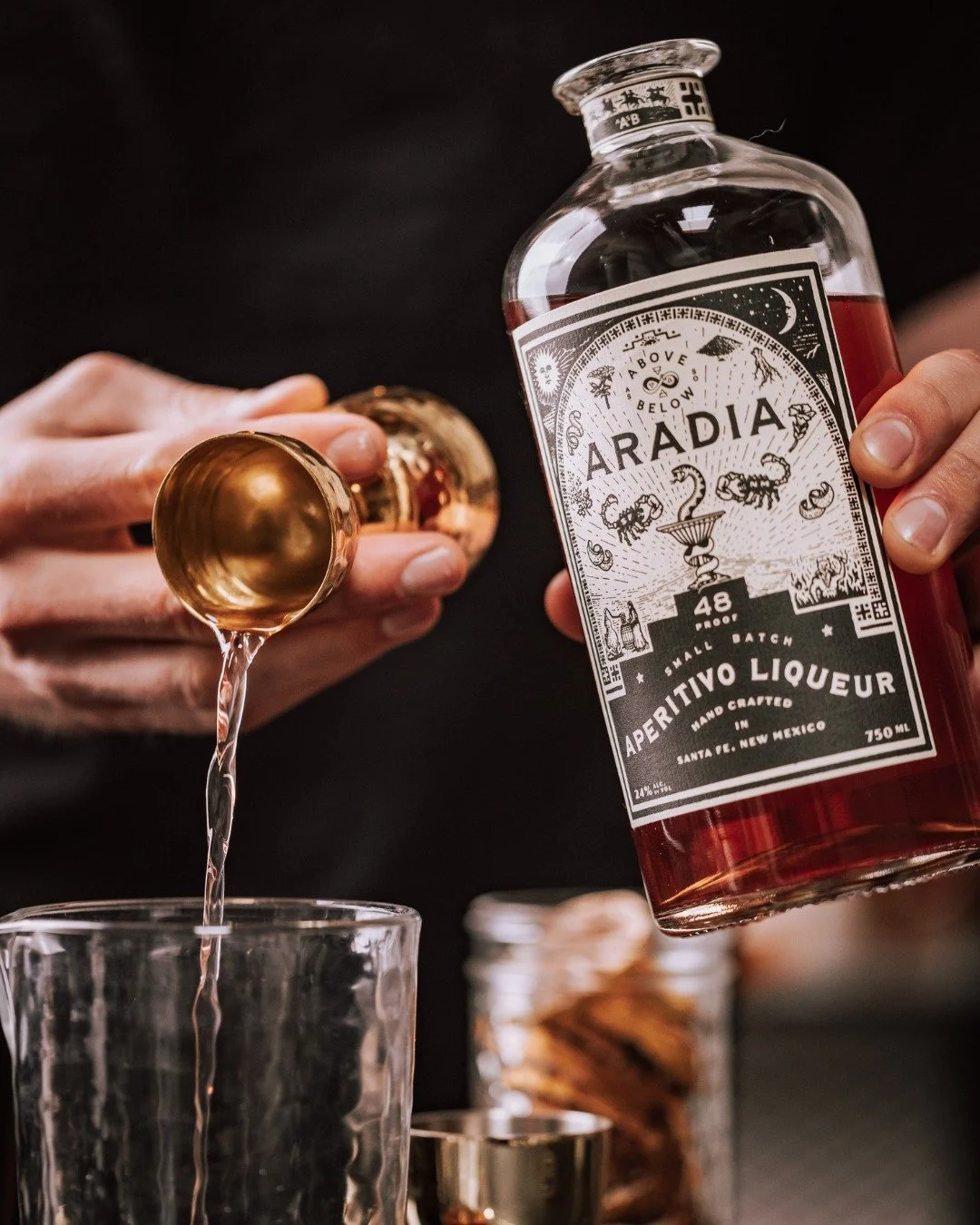
THE SYSTEM
More than labels—a symbolic framework.
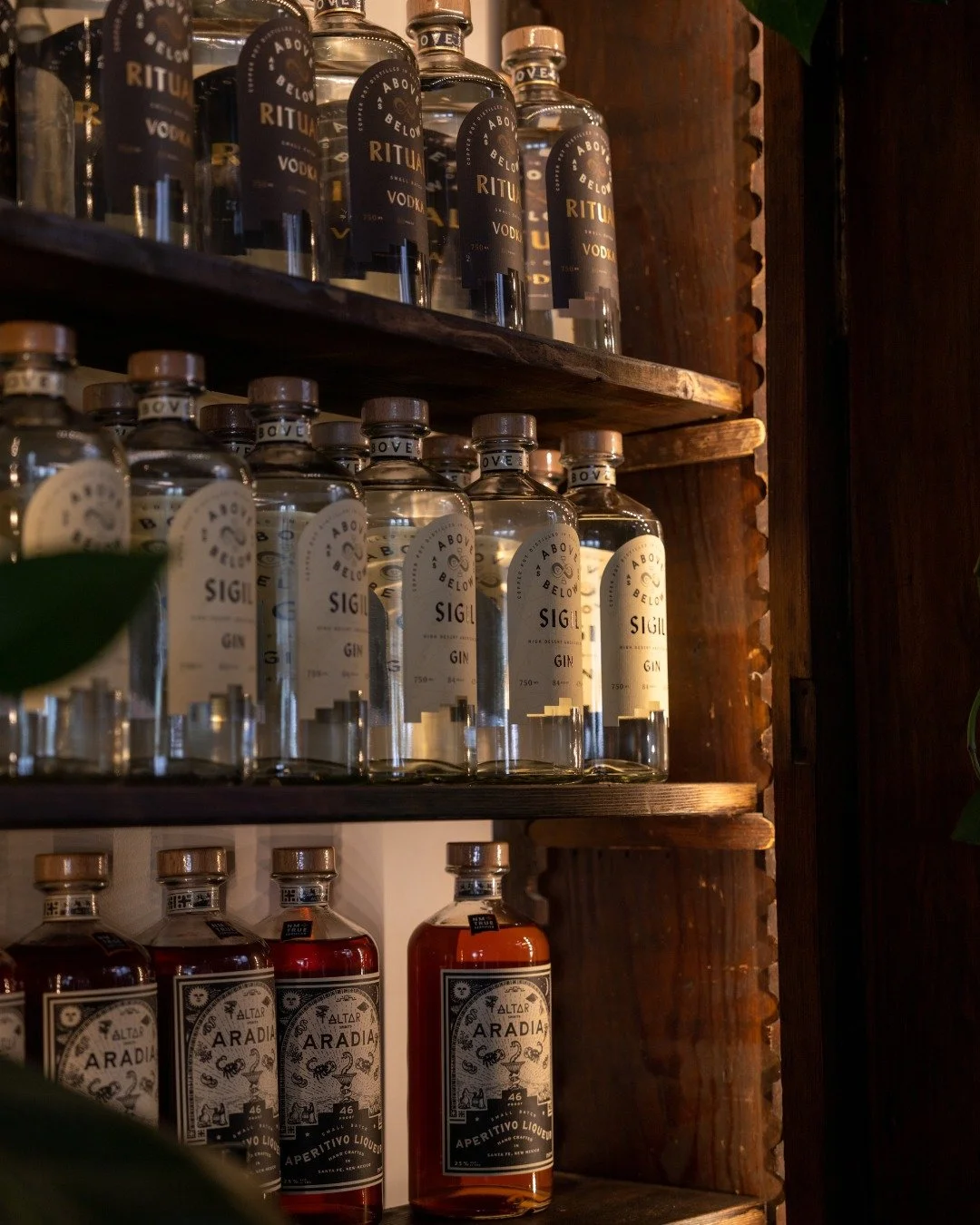
Each design functions as both an individual artifact and part of a larger system.
Tarot-inspired visual language across all SKUs
Structured hierarchy for spirit categories and variations
Consistent framing, typography, and ornamental systems
Flexible design foundation for future releases and collaborations
The result is a brand that feels immersive, intentional, and endlessly expandable.
FEATURED WORK
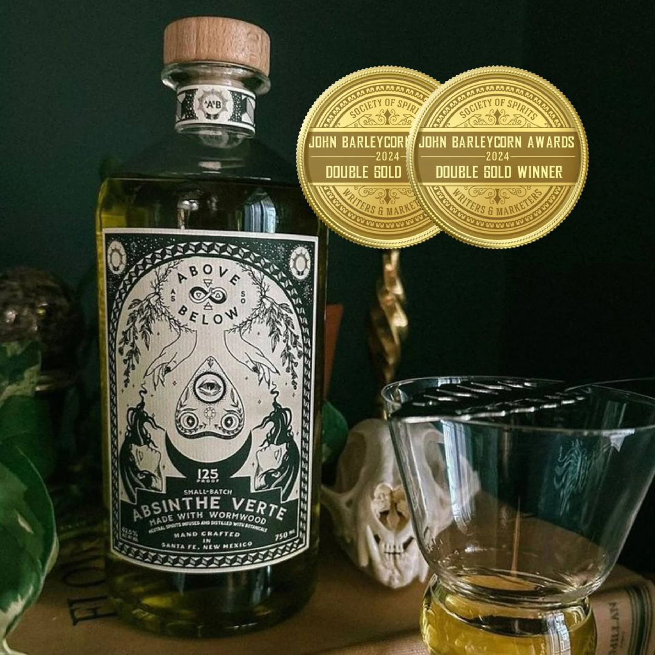
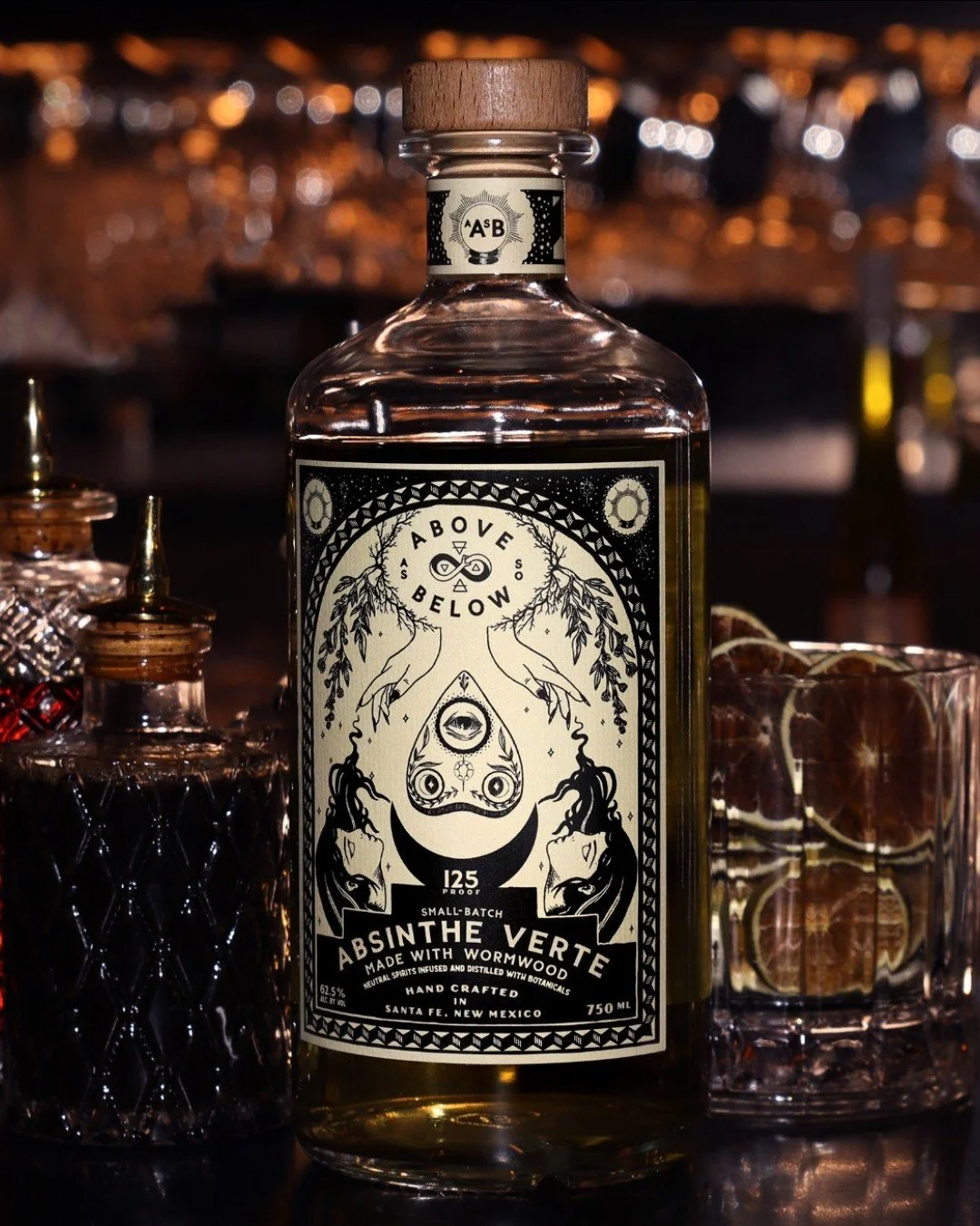
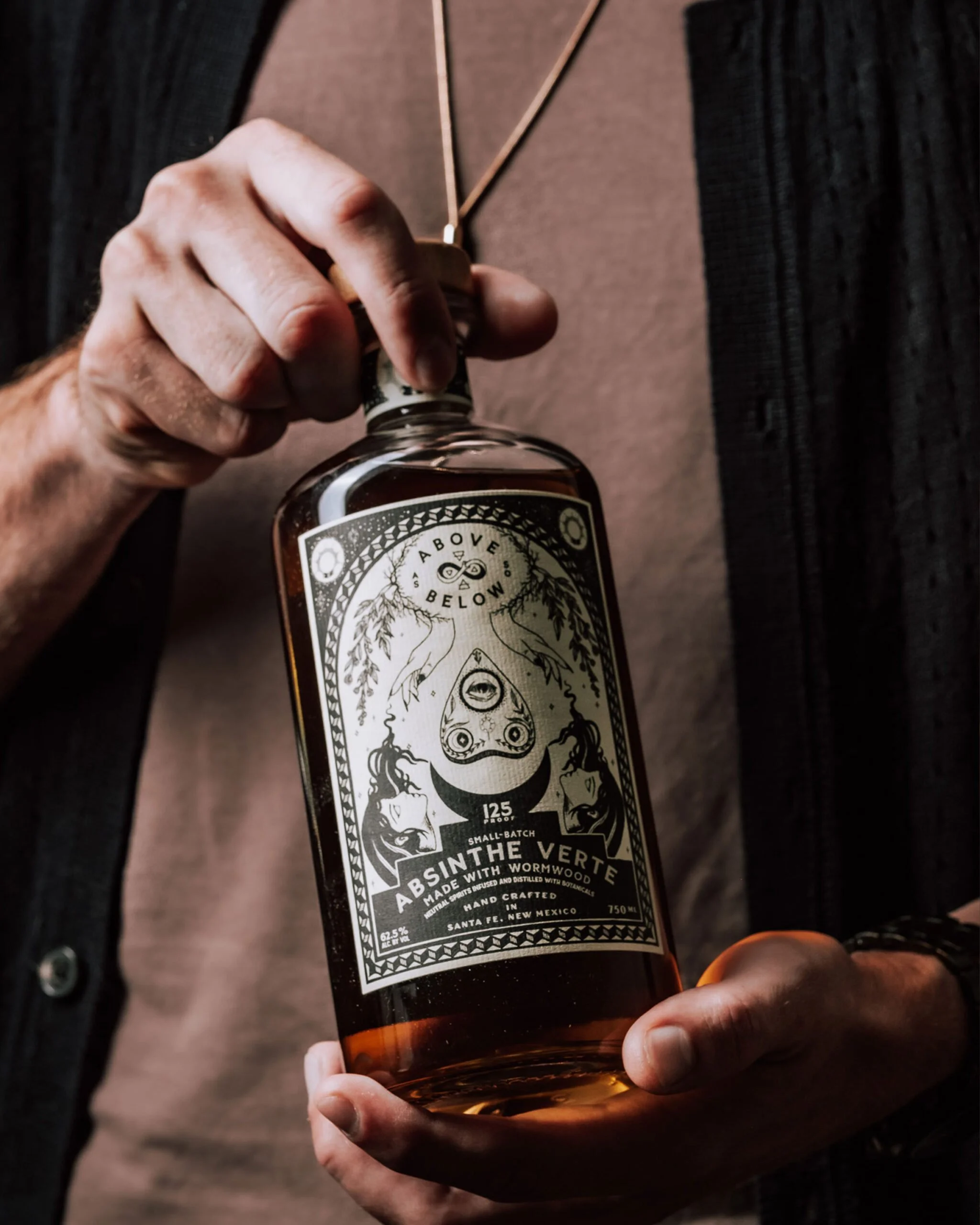
Absinthe Verte (Flagship)
A highly detailed, illustration-forward label designed to capture the complexity and ritual of absinthe.
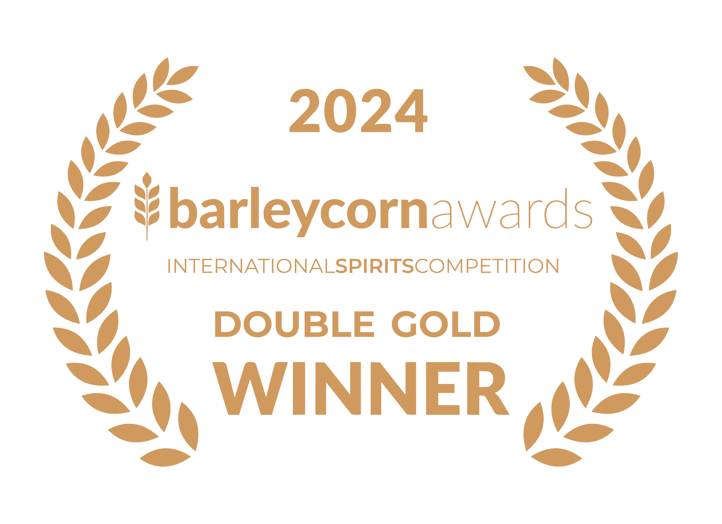
Awarded Double Gold for packaging design, the piece balances whimsy, precision, and narrative depth—creating a product that feels as layered as the spirit itself.
Double Gold Winner
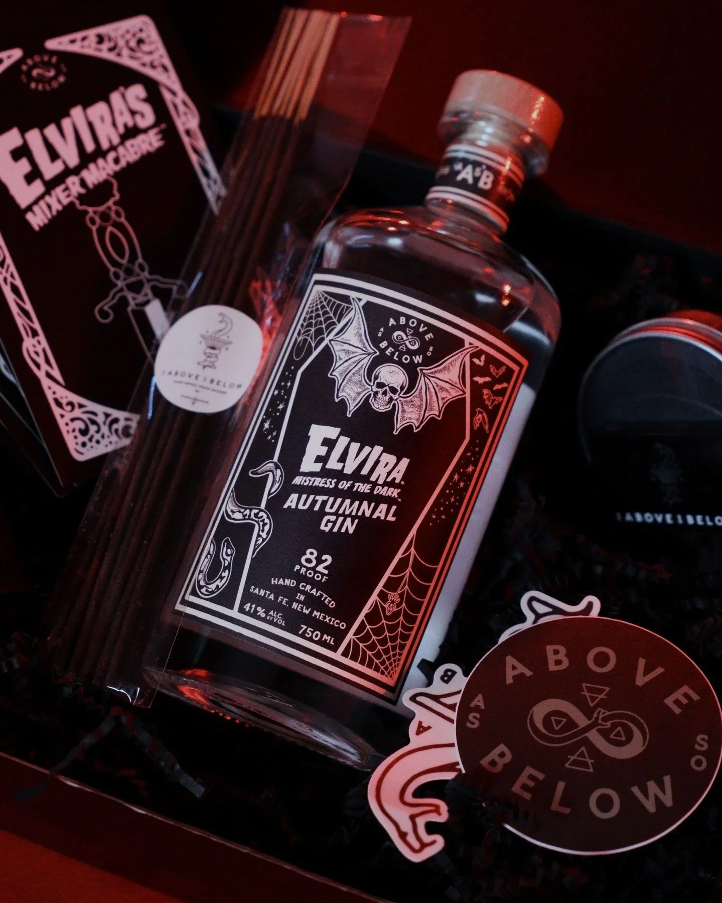
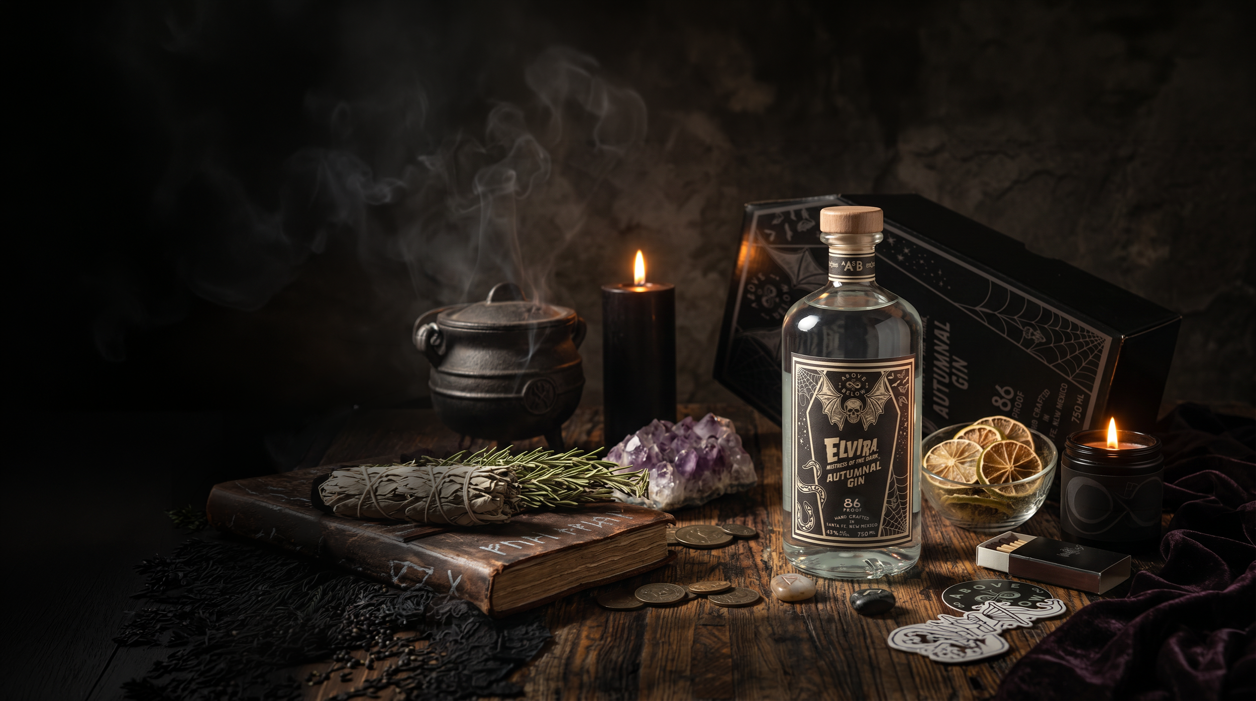
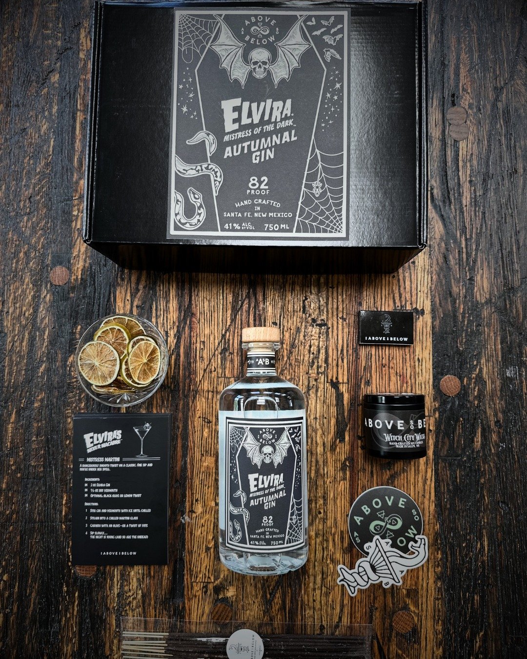
Elvira, Mistress of the Dark — Autumnal Gin
A limited-edition collaboration blending iconic character branding with the established AASB system.
The design merges Elvira’s bold, gothic presence with the brand’s structured visual language—resulting in a piece that feels both collectible and cohesive.
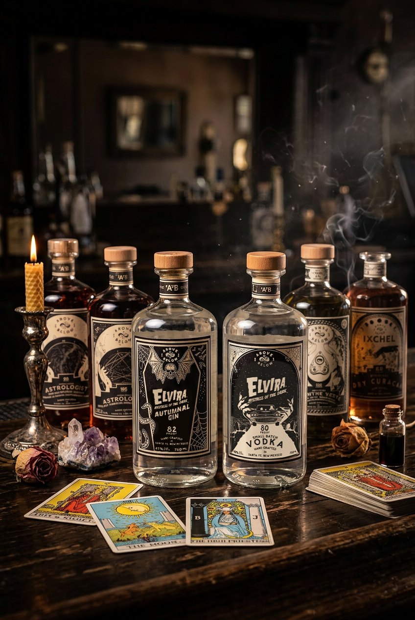
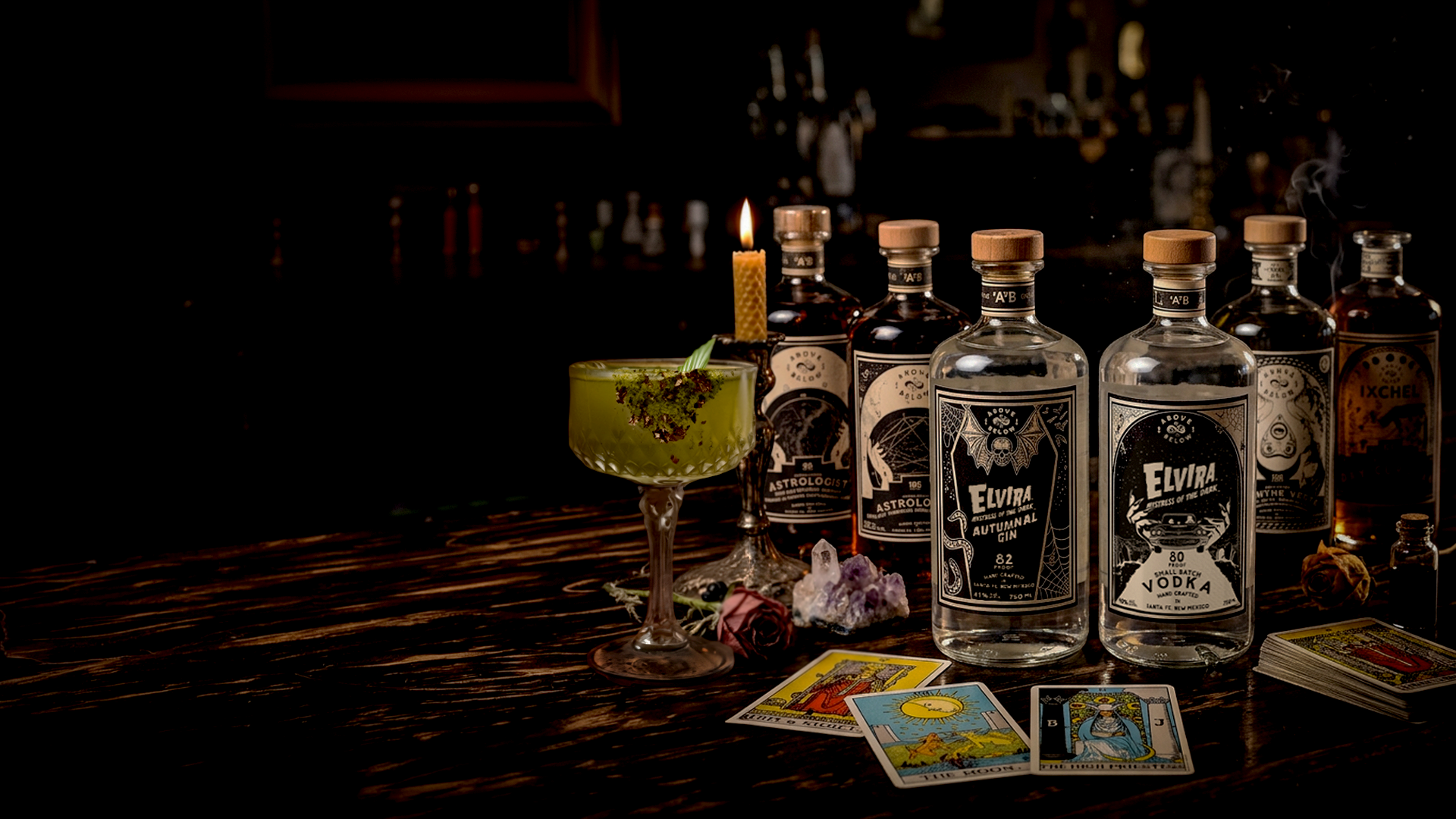
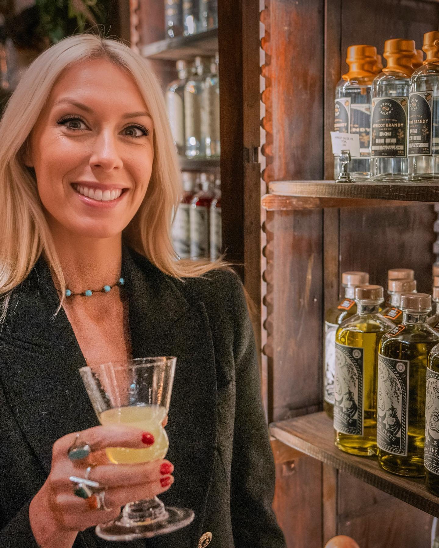
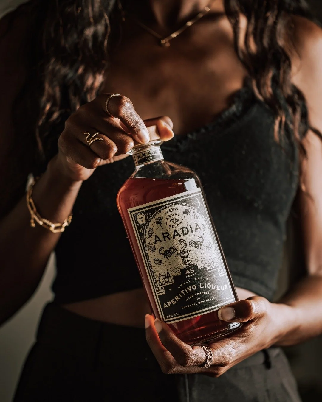
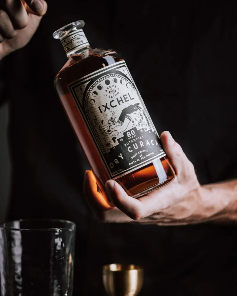
Core Line + Tarot System
Across the full product line, each label was designed as part of a larger tarot-inspired system.
From illustration to typography to layout structure, every element reinforces a shared visual language—ensuring consistency while allowing each product to maintain its own identity.
EXECUTION
Shelf presence and retail storytelling
Collector-driven limited releases
IMPACT
Award-Winning Design + Celebrity Endorsement
Full Brand System Development
Built for Storytelling. Built for Scale.


SOME BRANDS SELL PRODUCTS.
OTHERS BUILD WORLDS.
As Above, So Below was designed to do both— inviting people not just to drink, but to experience something deeper.