Evil Bean Coffee Liqueur
A bold, narrative-driven label built to seduce the shelf.

overview
Evil Bean was designed to stand out in a category dominated by tradition.
The goal was to create a label that felt elevated yet unconventional—something that could hold its own among heritage spirits while introducing a sense of intrigue, personality, and modern craft.
The result is a brand that leans into contrast: refined yet rebellious, classic yet unexpected.
the challenge
Breaking through a traditional category.
Coffee liqueur packaging often leans safe—dark palettes, minimal storytelling, and familiar visual cues. The challenge was to create something distinctive without losing credibility.
the approach
Narrative through detail.
I built a label that invites discovery—layering intricate illustration, typography, and symbolism to create a sense of depth and personality while maintaining a premium, shelf-ready presence.
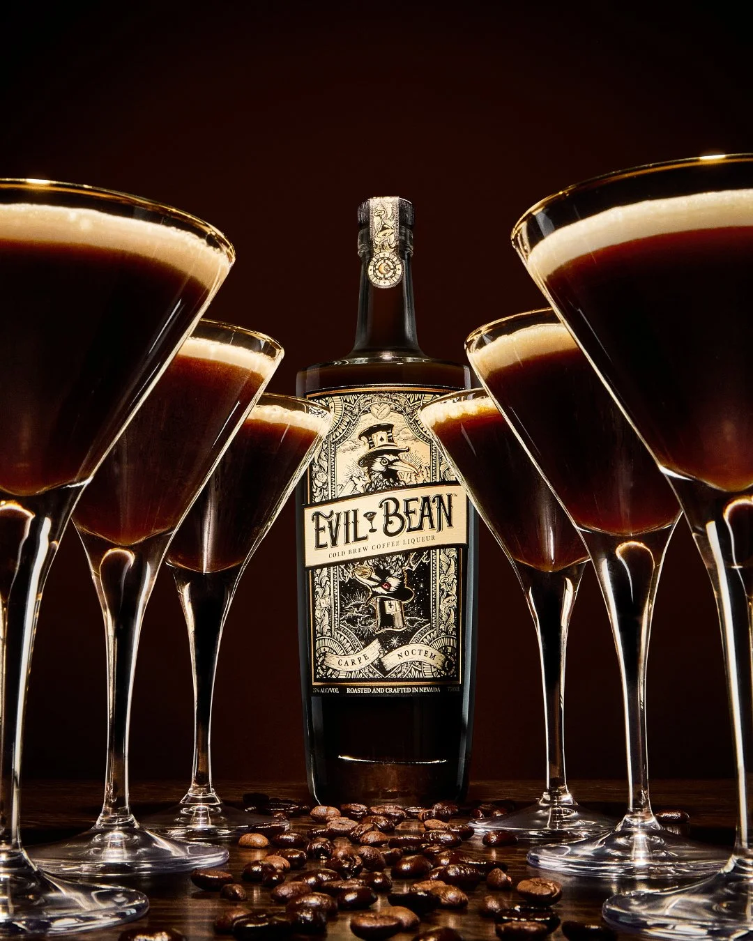
THE DESIGN
A Study in Contrast.
The design balances structure and expression—combining a classic label framework with richly detailed illustration and unexpected character.
Custom illustration with a narrative-driven focal point
Vintage-inspired typography with modern refinement
Ornamental framing to create hierarchy and structure
A restrained palette to emphasize depth, texture, and mood
Every element works together to create a label that feels both timeless and unmistakably distinct.
FEATURED DETAILS
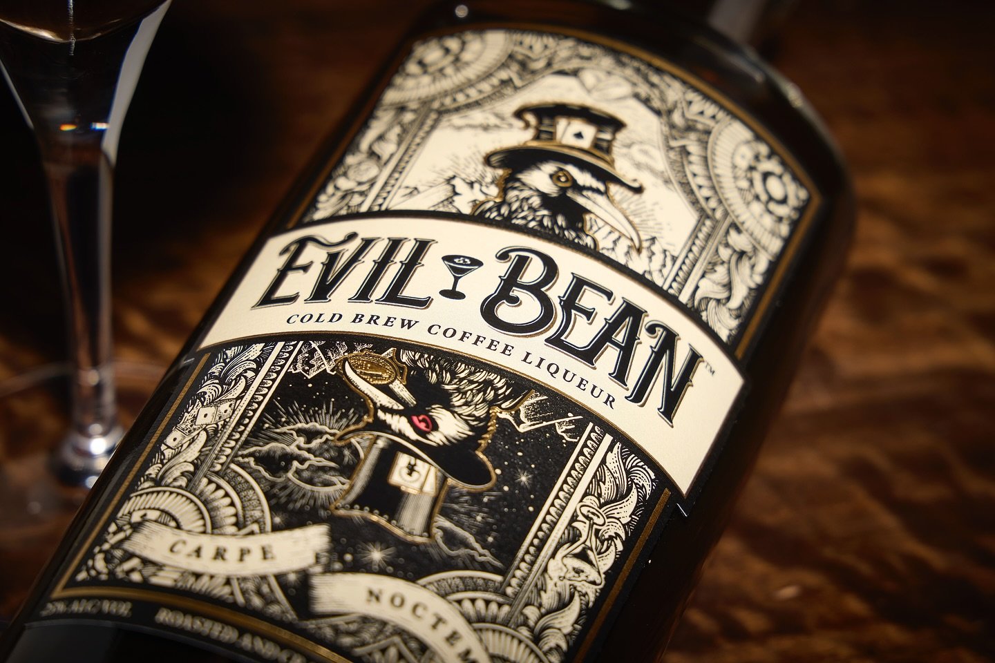
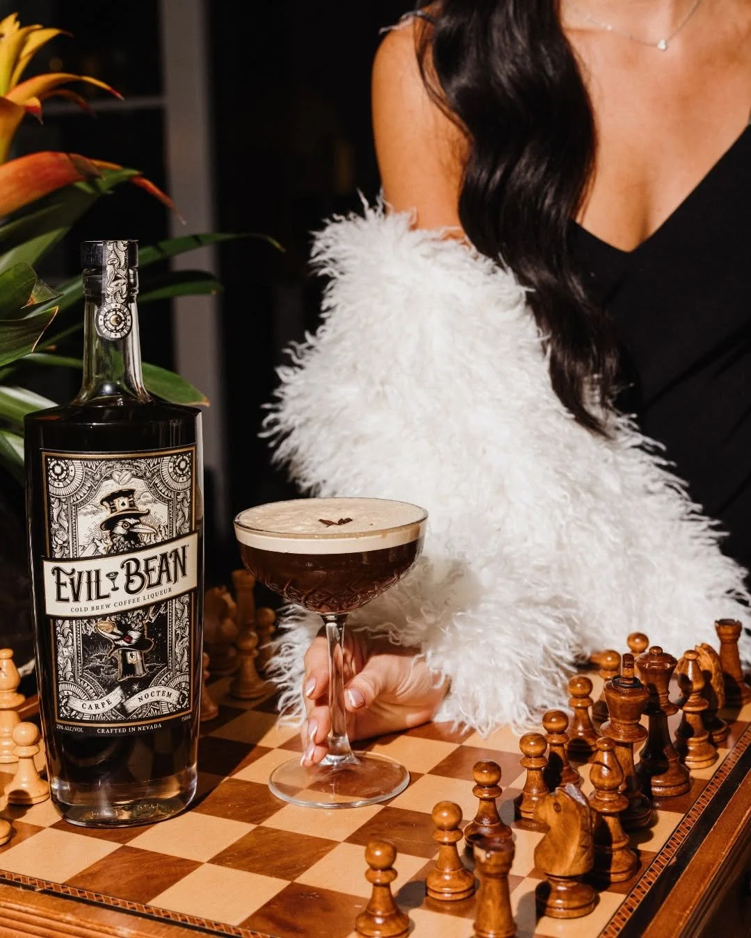
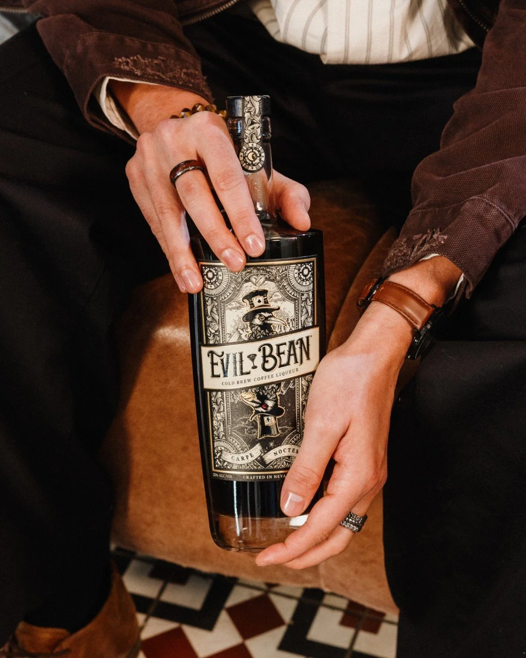
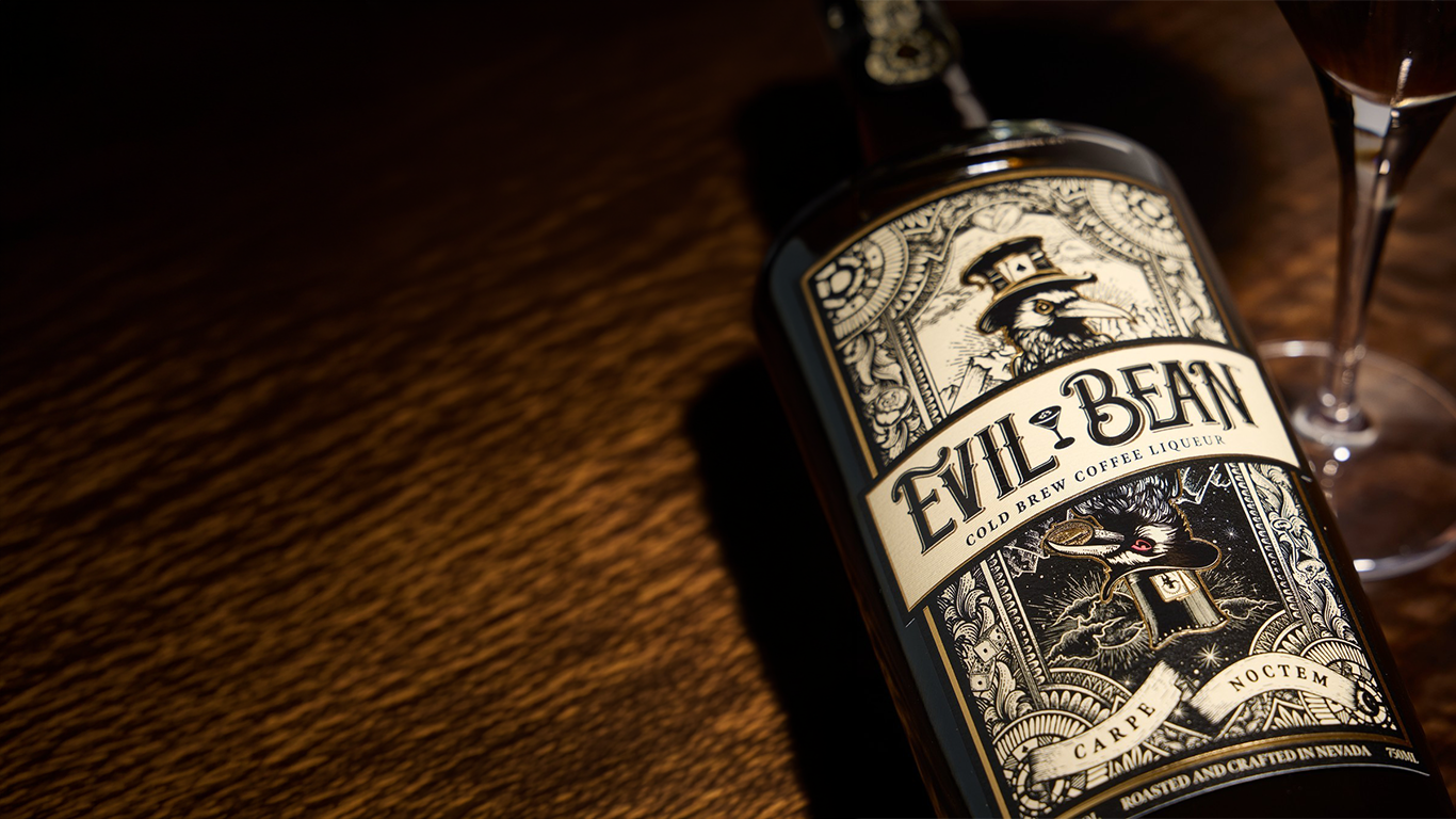
The Character
At the center of the design is a character that anchors the brand—bringing personality, intrigue, and a sense of story to the product.

Typography
The typography blends vintage influence with modern precision—ensuring readability while reinforcing the brand’s elevated tone.

Composition
A structured layout system keeps the label grounded—allowing the illustration to shine without sacrificing clarity or hierarchy.
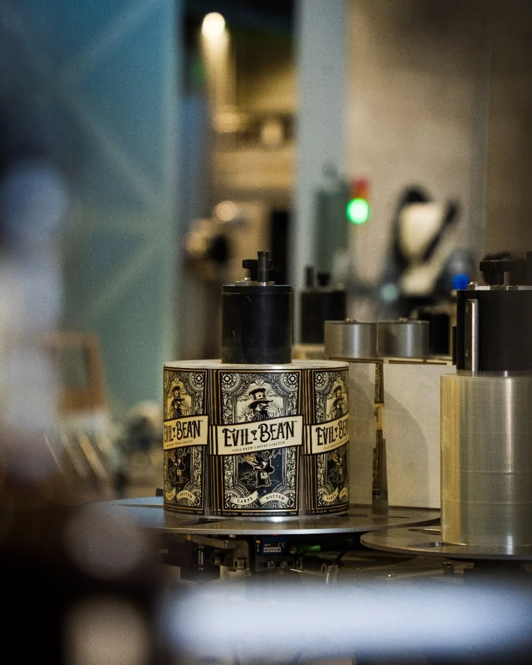
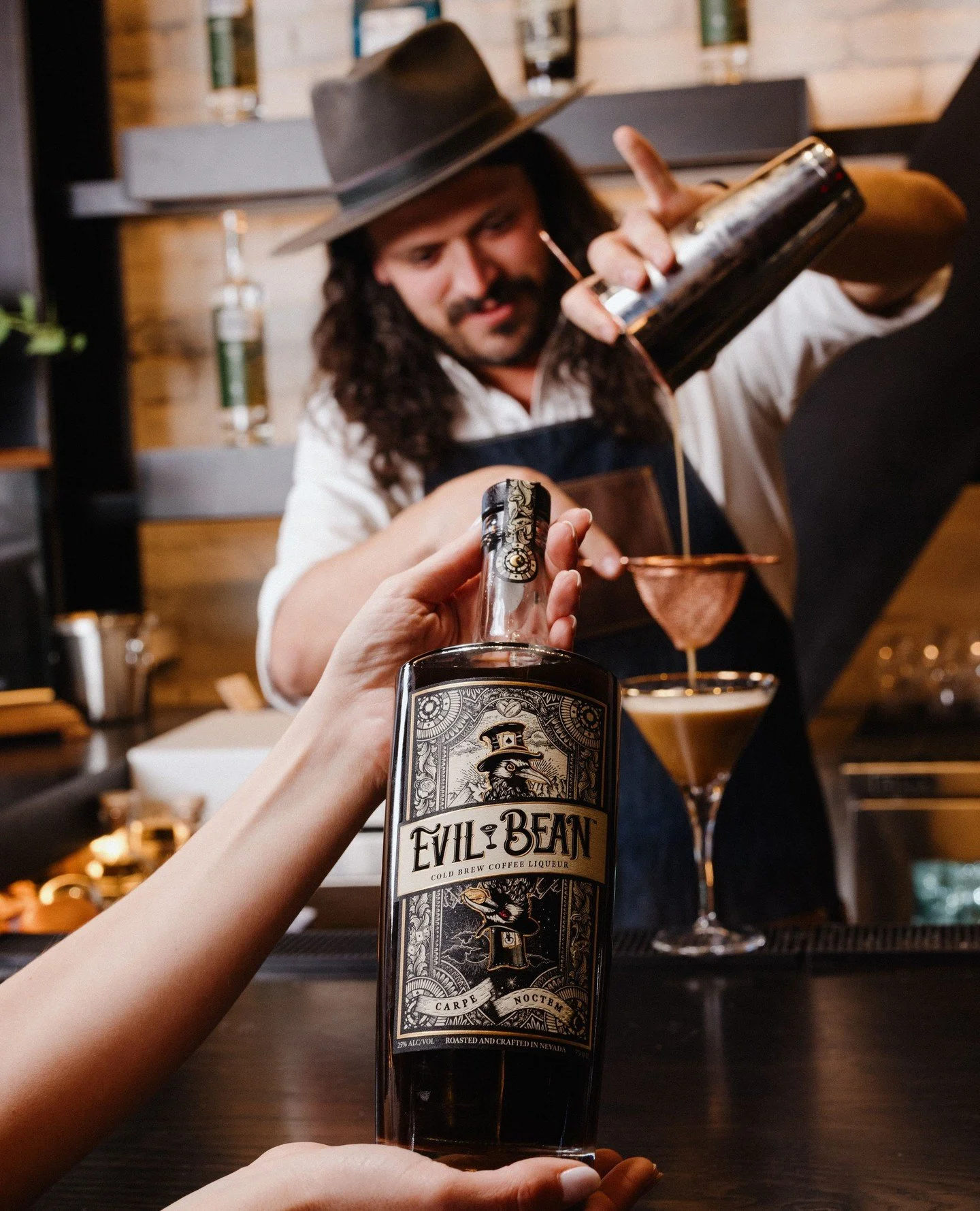
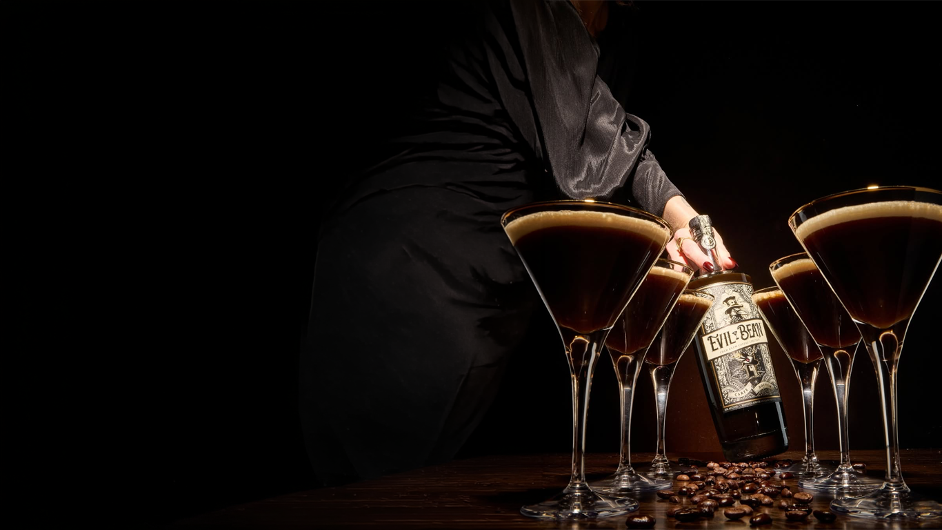
IMPACT
The label was developed with shelf presence in mind—ensuring it performs in retail environments while maintaining its detail and integrity up close.
SILVER MEDAL - Tasting Alliance Design Awards
Premium Craft Positioning
Built to Stand Out in a Traditional Category
From bar displays to digital use, the design holds its character across every touchpoint.